Classy nails occupy a specific lane — polished enough for a client dinner, refined enough for a gallery opening, and timeless enough that nobody asks whether you are trying too hard.
These fifteen sets are about looking expensive without explanation — chocolate French tips, wine that reads like velvet, a nude almond set that catches light once per gesture.
See also: french tip nails, nude nails, and chrome nails.
From chocolate French tips and boardroom burgundy to espresso glaze and old-money pink. Tap any design to jump straight to it.
1. A Deep French Tip in Chocolate Instead of White
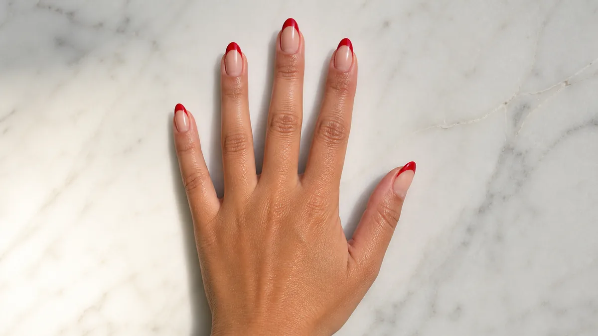
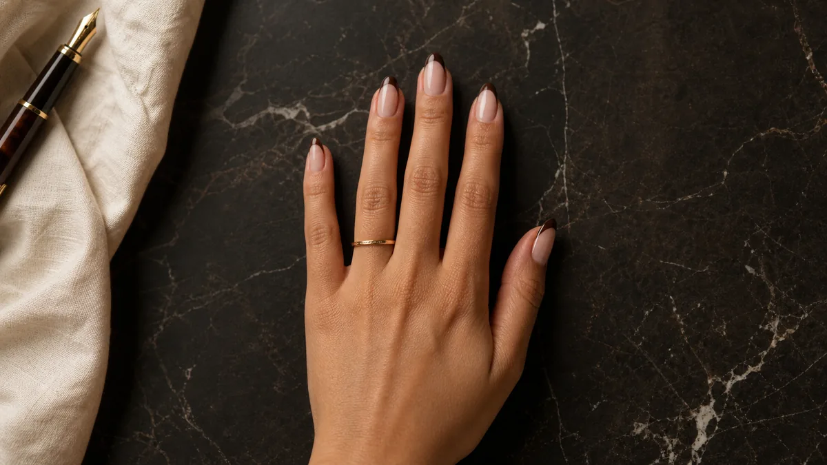
The traditional white French tip has been rewritten in chocolate brown — a deep, warm espresso tone that hugs the free edge of an almond nail. The effect is polished without being predictable. This tonal shift takes the same structure everyone recognizes and pushes it into a richer, quieter register that works from the office to a late dinner.
The opacity matters here. A single clean line of chocolate at the tip against a sheer pink base creates enough contrast to define the shape without announcing itself across the room. The almond shape softens the precision of the tip line, blending architectural structure with organic curves. See also: brown nails.
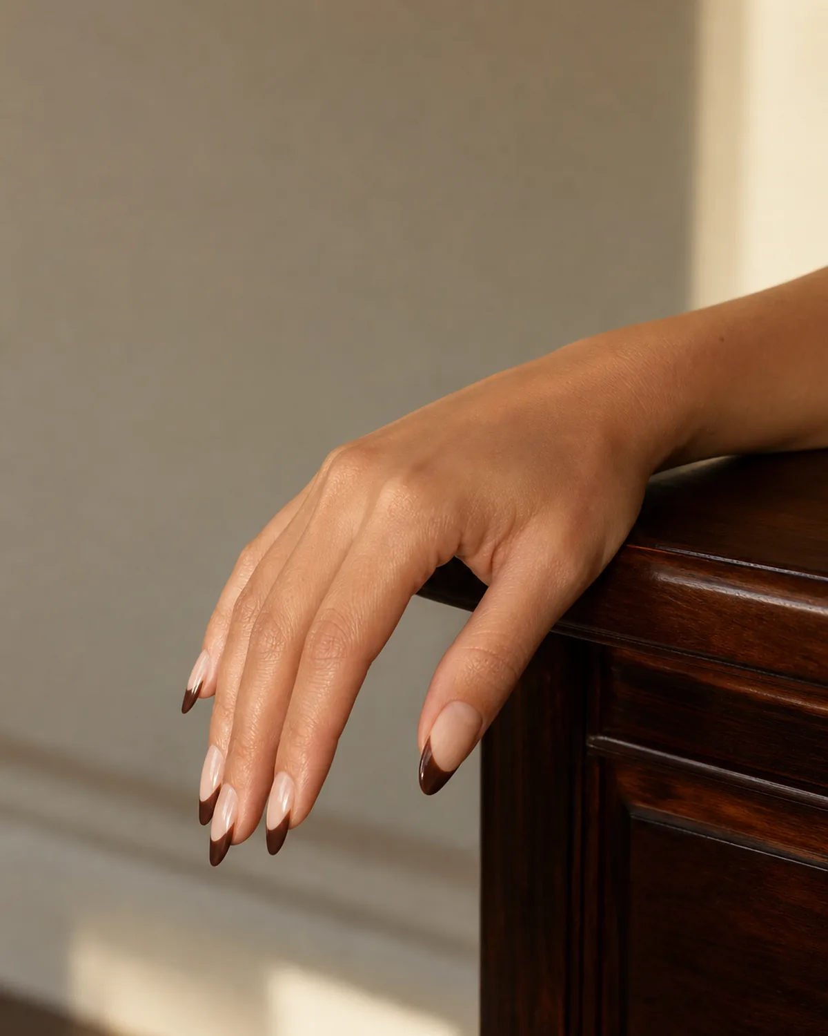
- Deep chocolate brown replaces the classic white French tip.
- Almond shape softens the architectural tip line.
- Sheer pink base provides subtle contrast without high drama.
- Works seamlessly from office to evening without a color change.
- The tonal twist that makes a familiar structure feel new.
2. Boardroom Burgundy on a Short Square
Short square nails in a single deep burgundy coat — no accent nails, no negative space tricks, no embellishment. The color does the heavy lifting. Burgundy reads as intentional, serious, and warm without crossing into corporate-costume territory. A glossy topcoat keeps the depth alive under fluorescent lighting.
The short length is the key. Burgundy on a long stiletto reads nightlife. Burgundy on a short square reads boardroom power — the kind of manicure that signals attention to detail without demanding attention itself. One coat builds enough depth to look saturated; two coats make it nearly opaque and velvety.
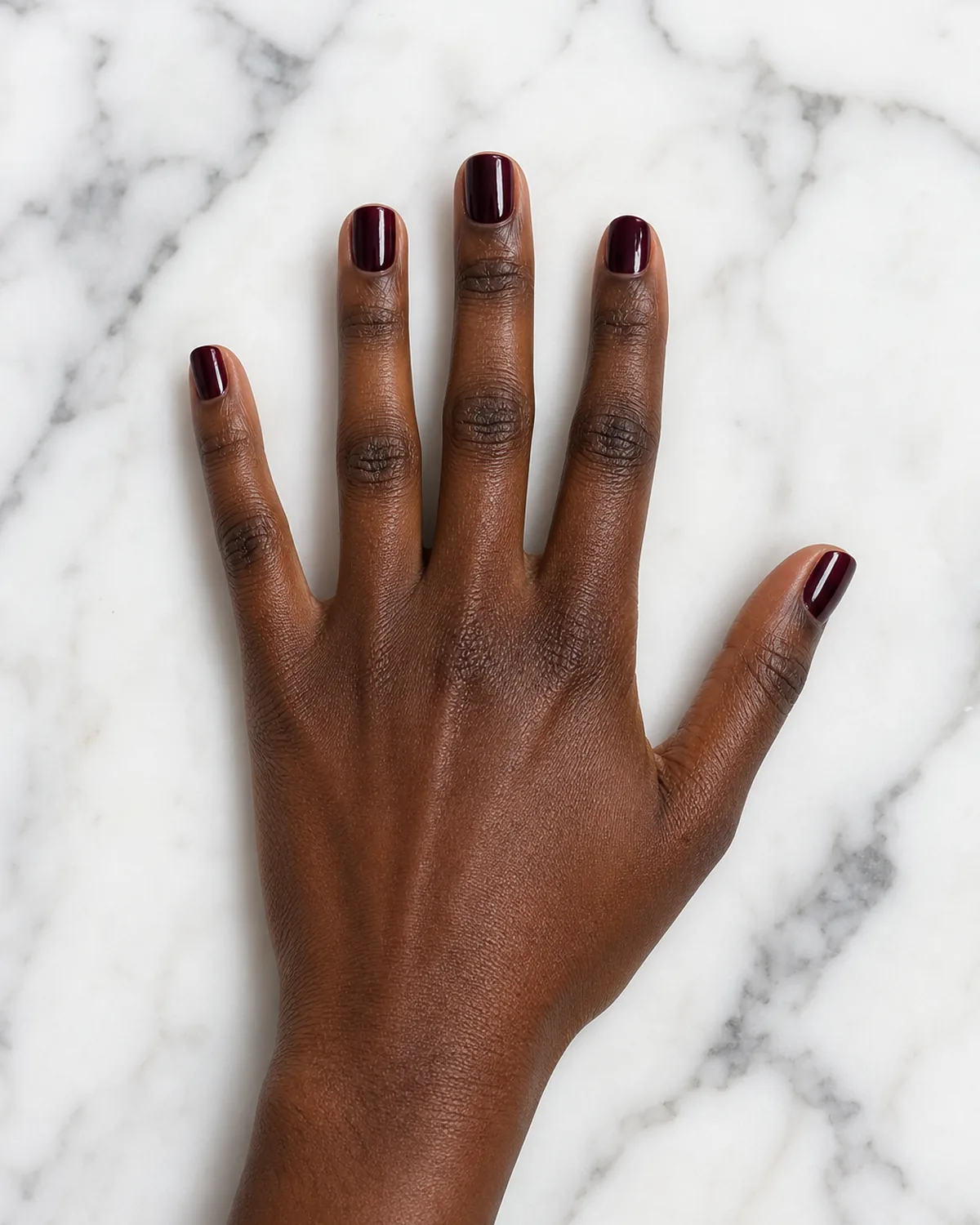
- Deep burgundy in a single-shade application, no accent nails.
- Short square shape shifts burgundy from nightlife to professional.
- Glossy finish preserves color depth under office lighting.
- Warm enough to avoid the coldness of pure red.
- The power manicure that never looks like it is trying.
3. Why Tonal Mauve Reads Richer Than Bright Pink
A dusty mauve that lands between nude and plum, sitting exactly where expensive-looking polish lives. This shade avoids the bubblegum trap of bright pink and the flatness of beige. On a medium-length oval, it reads like old-money polish — the kind of color that makes people assume the wearer owns good leather and knows which fork to use first.
The trick is in the grey undertone. Mauve carries enough purple to distinguish itself from nude but enough grey to prevent it from reading as playful. It is the shade that a nail technician reaches for when a client asks for something elegant but cannot articulate exactly what that means.
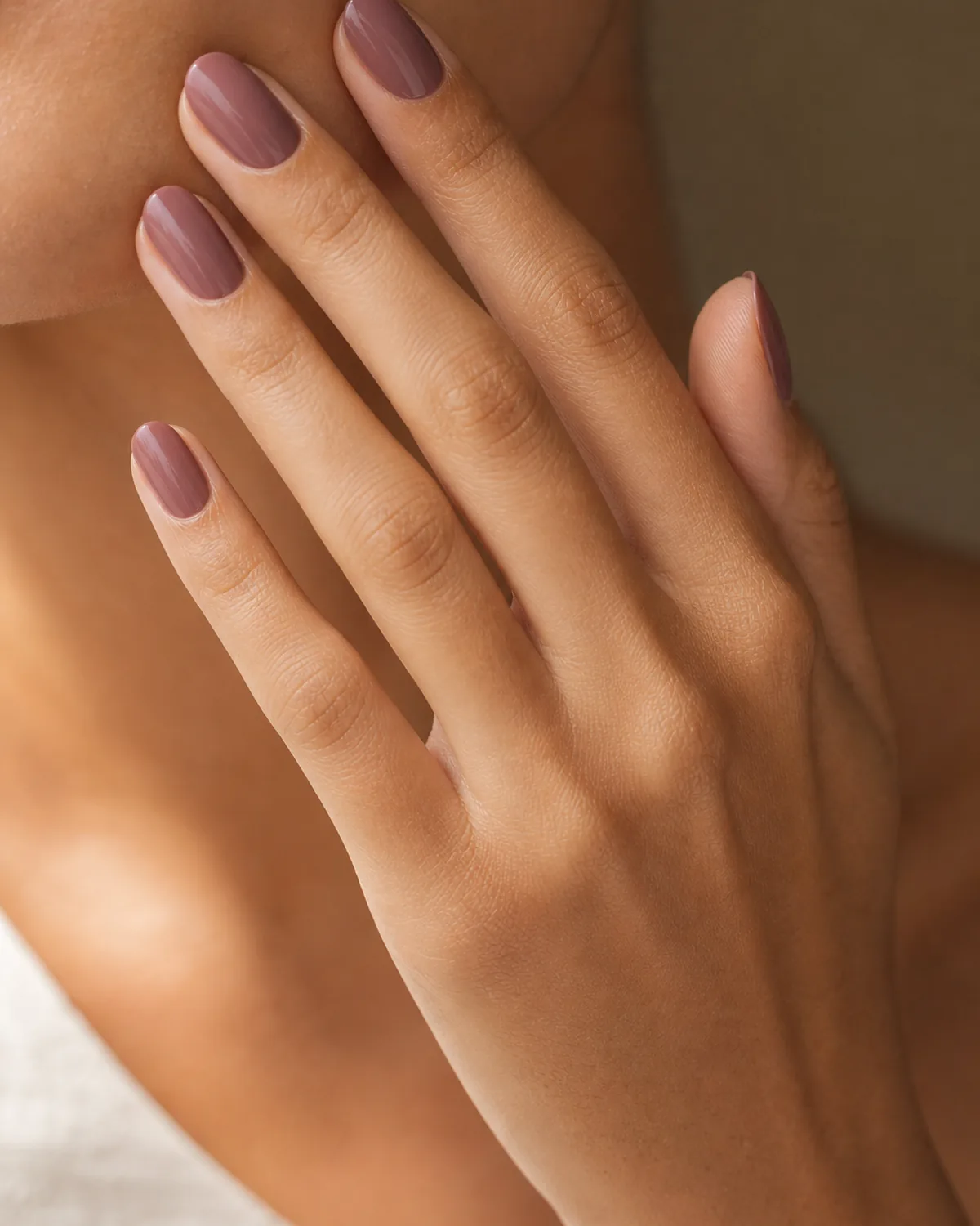
- Dusty mauve: the midpoint between nude and plum.
- Grey undertone prevents it from reading as playful pink.
- Medium oval shape keeps the look organic and refined.
- The shade people describe as expensive without knowing why.
- Works across every skin tone without shifting warm or cool.
The same shade reads differently depending on the finish. Here is how to match the finish to the occasion.
4. She Wore One Coat of Sheer Wine and It Looked Like Velvet
A sheer wine jelly that lets the natural nail bed show through beneath it, creating a depth that opaque polish cannot replicate. The single coat catches light differently at every angle — dark garnet from above, warm rosewood from the side. It is the polish equivalent of a slip dress: simple, expensive-looking, and impossible to overdo.
On oval nails, sheer wine takes on an almost stained quality. The nail bed color blends with the wine tint to produce something unique to each person — no two applications look exactly the same. The translucency is the luxury here; opacity would flatten the shade into a standard deep red.
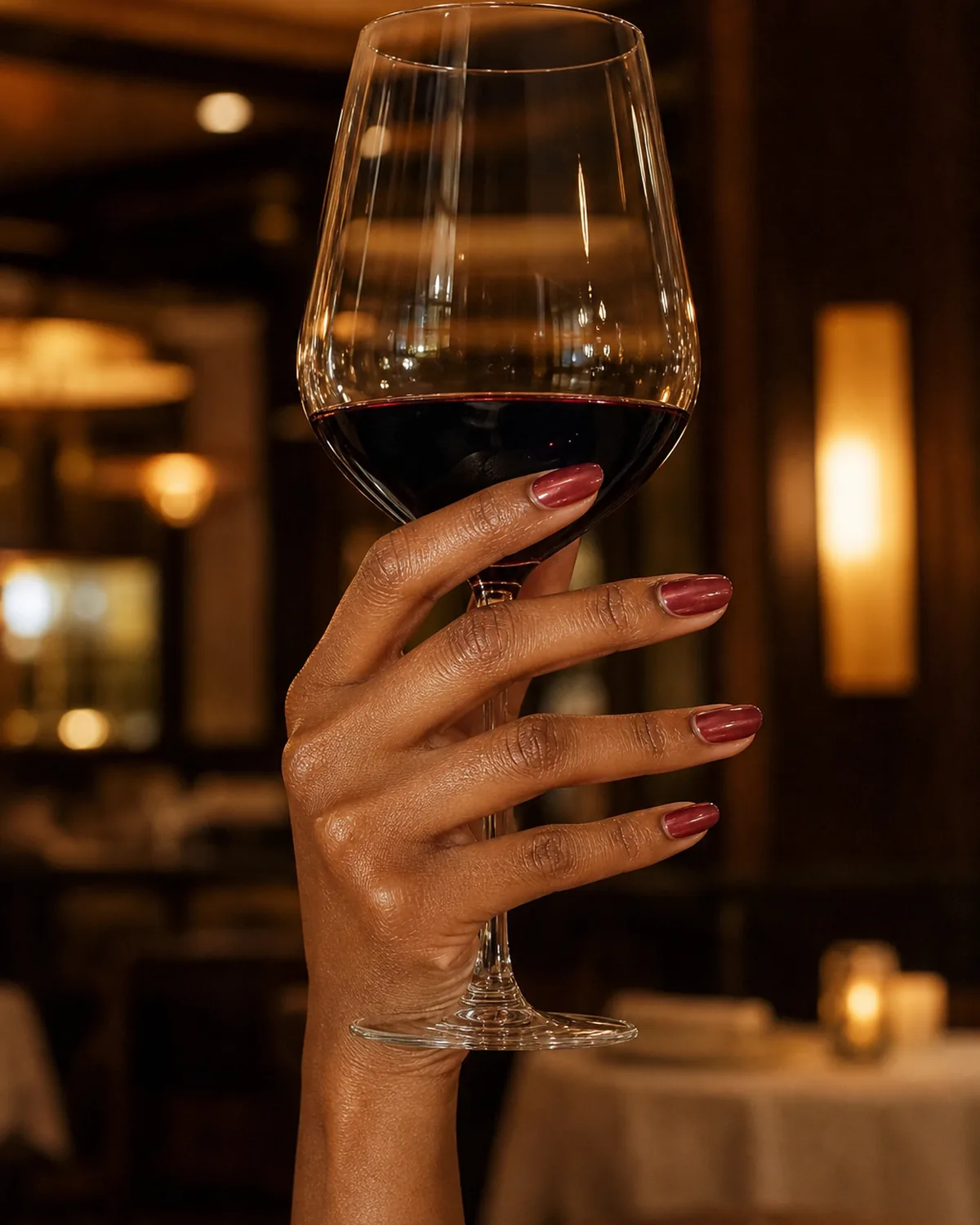
- Sheer wine jelly: one coat, translucent depth.
- Natural nail bed shows through for a unique stained effect.
- Shifts from garnet to rosewood depending on the light angle.
- Oval shape enhances the organic, fluid quality.
- The slip-dress principle applied to nails — simple and irreducible.
5. Half-Moon in Gold Foil on a Matte Nude Base
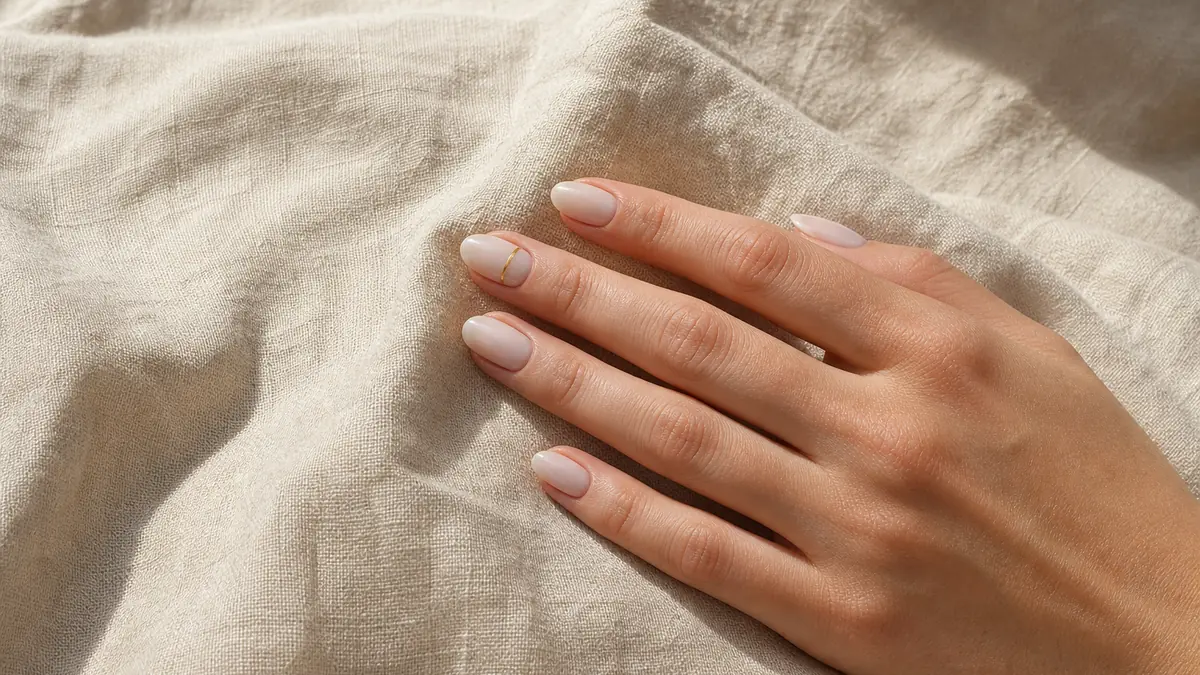
Matte nude across the entire nail, then a thin crescent of gold foil pressed into the half-moon at the base. The gold catches light only when the hand moves, making it the quietest accent possible. The matte-versus-metallic contrast is the entire design — no other elements needed.
This works because restraint does the heavy lifting. A full gold nail would read as party wear. A gold stripe across the center would read as nail art. But a crescent at the base — visible only at certain angles, catching light only in motion — reads as a considered detail that the wearer chose deliberately and then stopped.
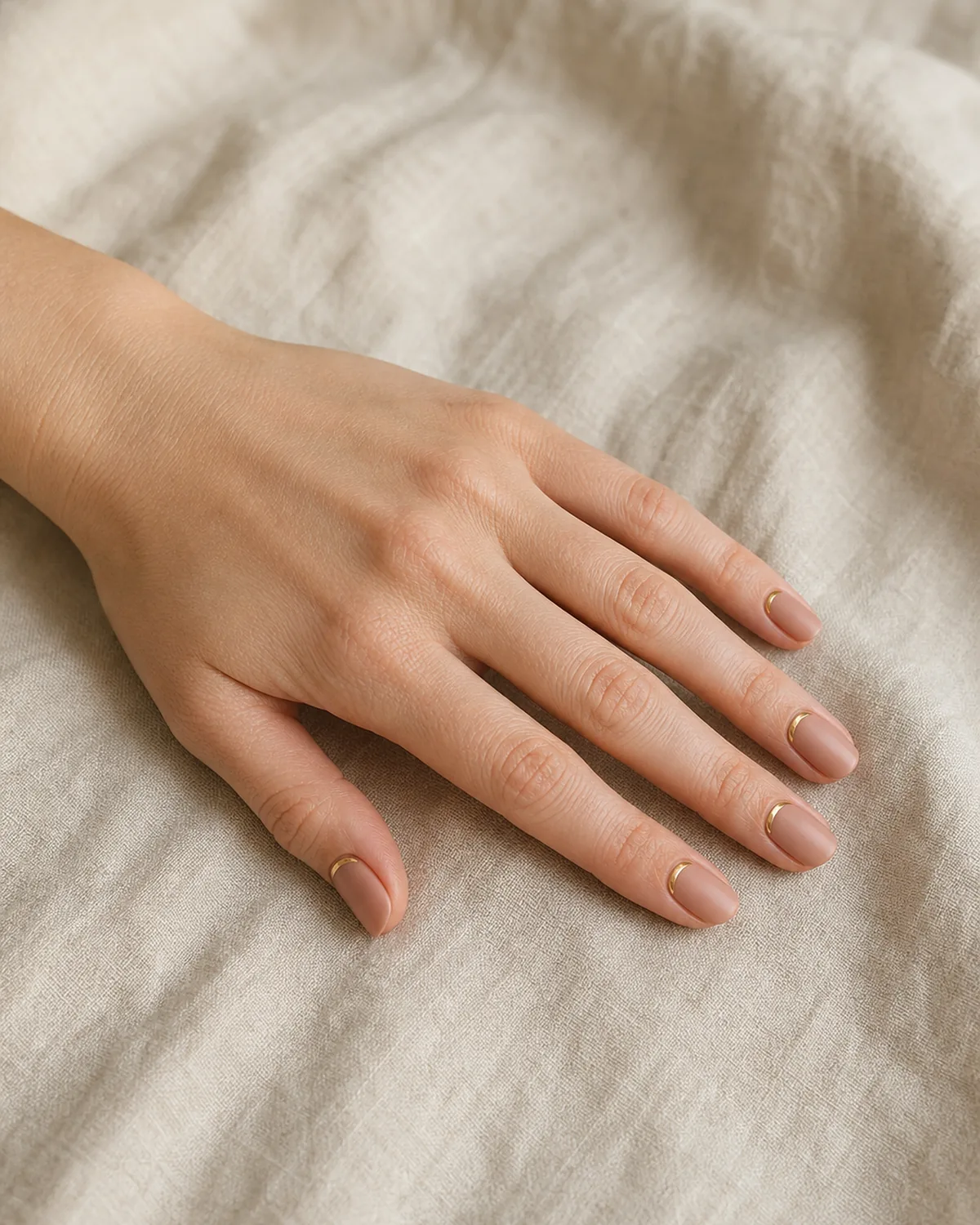
- Matte nude base with a single gold foil crescent at the lunula.
- Gold catches light only in motion — invisible in still photographs.
- Matte-metallic contrast replaces color contrast.
- Restraint is the design: one accent, one material, one location.
- Reads as a considered detail, not a decorative choice.
6. The Set That Goes from Desk to Dinner Without a Second Thought
A warm mushroom tone on coffin-shaped nails, topped with one coat of high-gloss. The shade falls between greige and warm taupe — neutral enough for corporate meetings, saturated enough for candlelit restaurants. This is the set that never needs to be changed between events.
The coffin shape adds structure without drama. It elongates the finger bed while maintaining enough width at the tip to look substantial rather than fragile. The warm mushroom shade photographs well in both daylight and indoor tungsten, which means it looks consistent across every environment the wearer moves through in a single day.
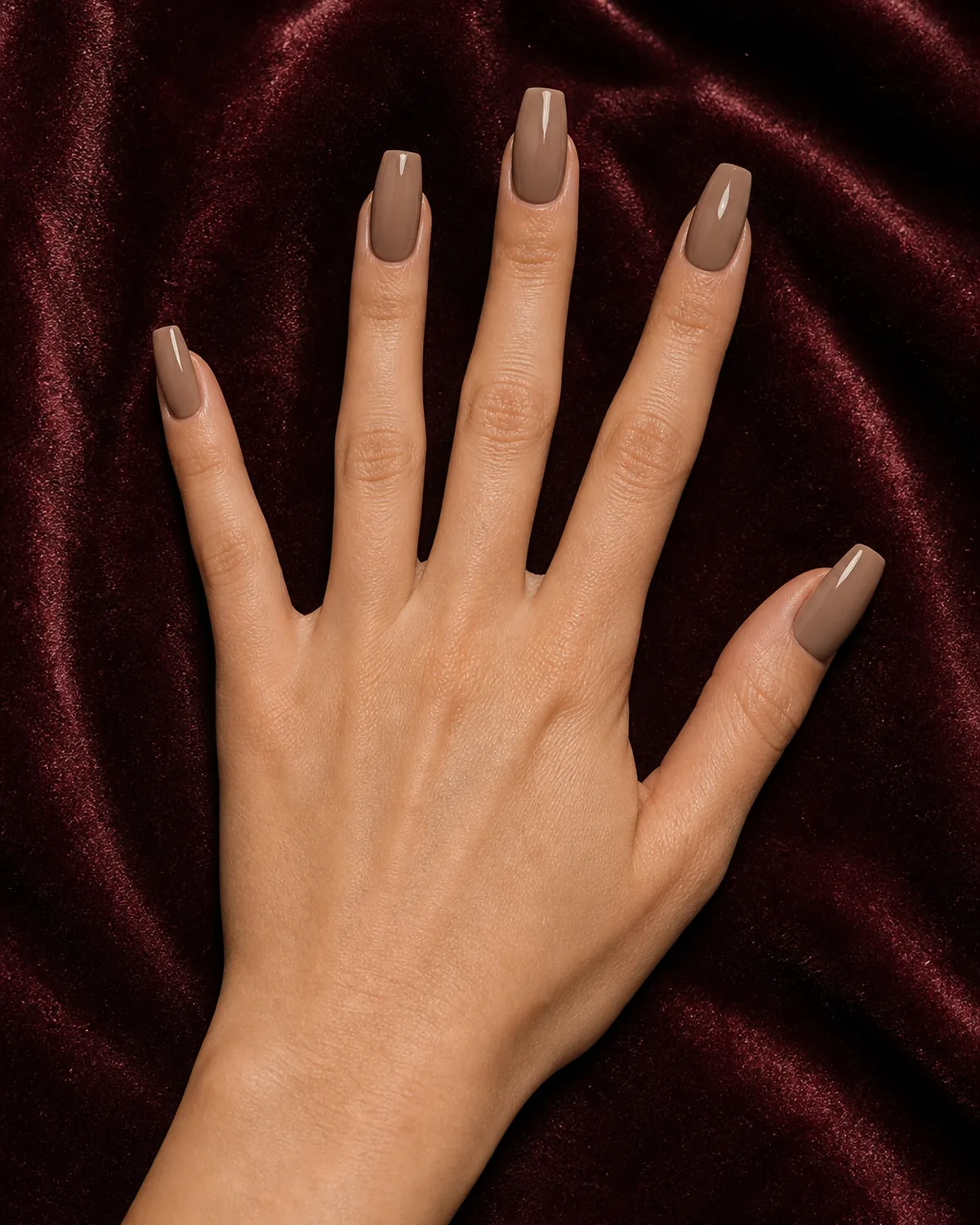
- Warm mushroom: the midpoint between greige and taupe.
- Coffin shape adds structure without fragility.
- High-gloss finish keeps the shade alive in dim lighting.
- Photographs consistently in daylight and tungsten.
- The universal set that requires no event-specific switching.
7. Thin Burgundy Tips on a Sheer Pink Base
Instead of thick white tips, these oval nails carry paper-thin lines of burgundy at the free edge over a sheer petal-pink base. The contrast is there, but whispered. Think of it as a French manicure that traded volume for precision — the kind of detail you notice on a second glance. See also: micro french nails.
The burgundy reads differently at this scale. A full burgundy nail is bold and warm. A burgundy line at the tip is architectural and deliberate. The sheer pink base keeps the overall impression soft, letting the thin line do the work of defining the nail shape without overpowering the hand.
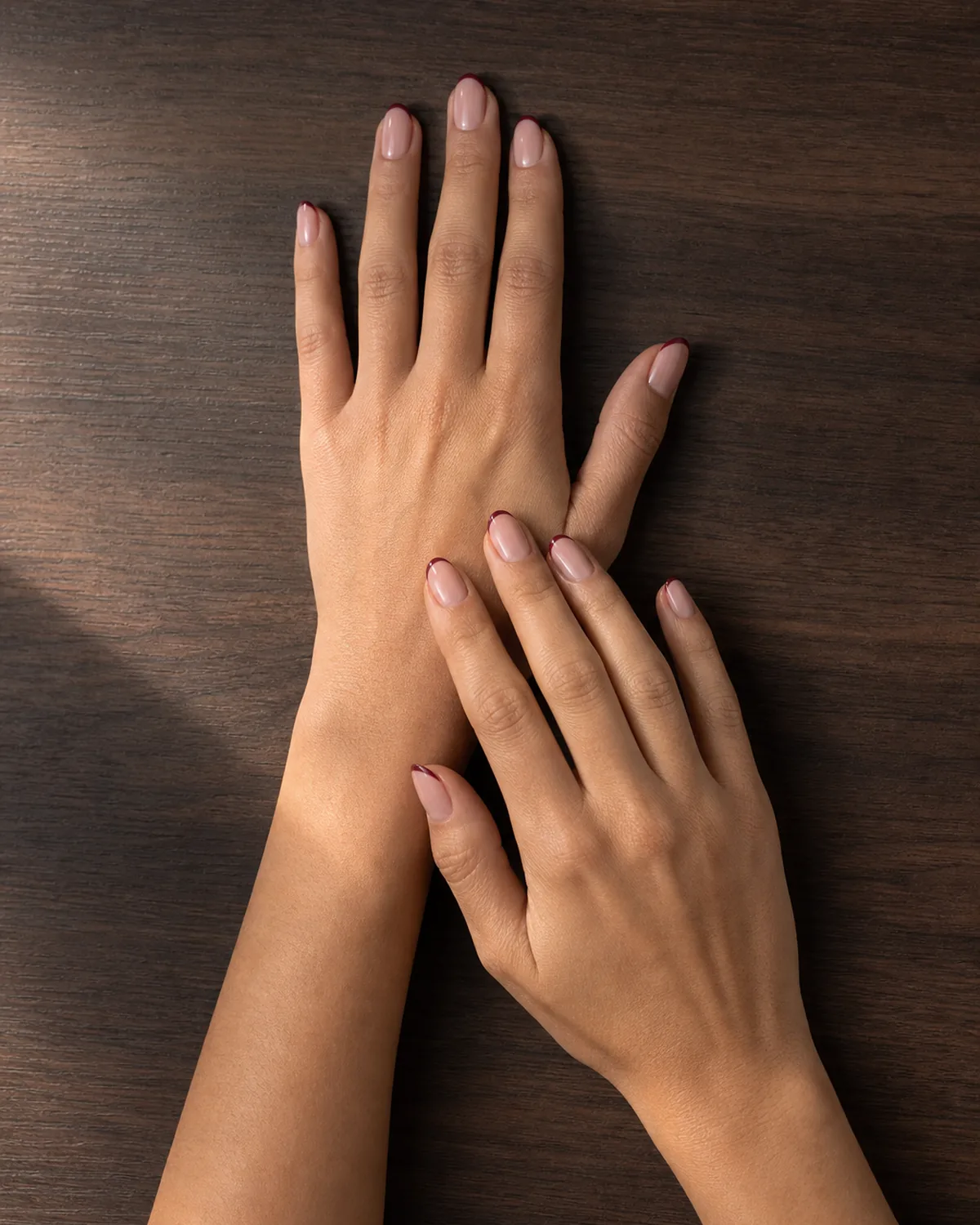
- Paper-thin burgundy lines replace the traditional white tip.
- Sheer petal-pink base keeps the overall look soft.
- Oval shape enhances the organic, elongated impression.
- French manicure logic traded volume for surgical precision.
- The detail that shows up only on a second glance.
Dark and deep shades show tip wear faster than brights. Four habits that extend the manicure.
8. Navy on an Almond Shape Feels Like Wearing a Tailored Blazer
Dark navy blue in one glossy coat on almond nail designs. Navy rarely shows up in nail trend lists, but it reads like an heirloom rather than a fashion statement. The depth of the color absorbs light in a way that makes the nail shape look more sculpted. Pair it with a signet ring and nothing else.
Navy occupies the same lane in polish that it occupies in clothing — neither black nor blue, it sits at the intersection of formality and warmth. On almond nails, the tapered tip draws the eye to the color depth rather than the shape, and the single coat maintains a slight translucency that prevents the shade from reading as flat or heavy.
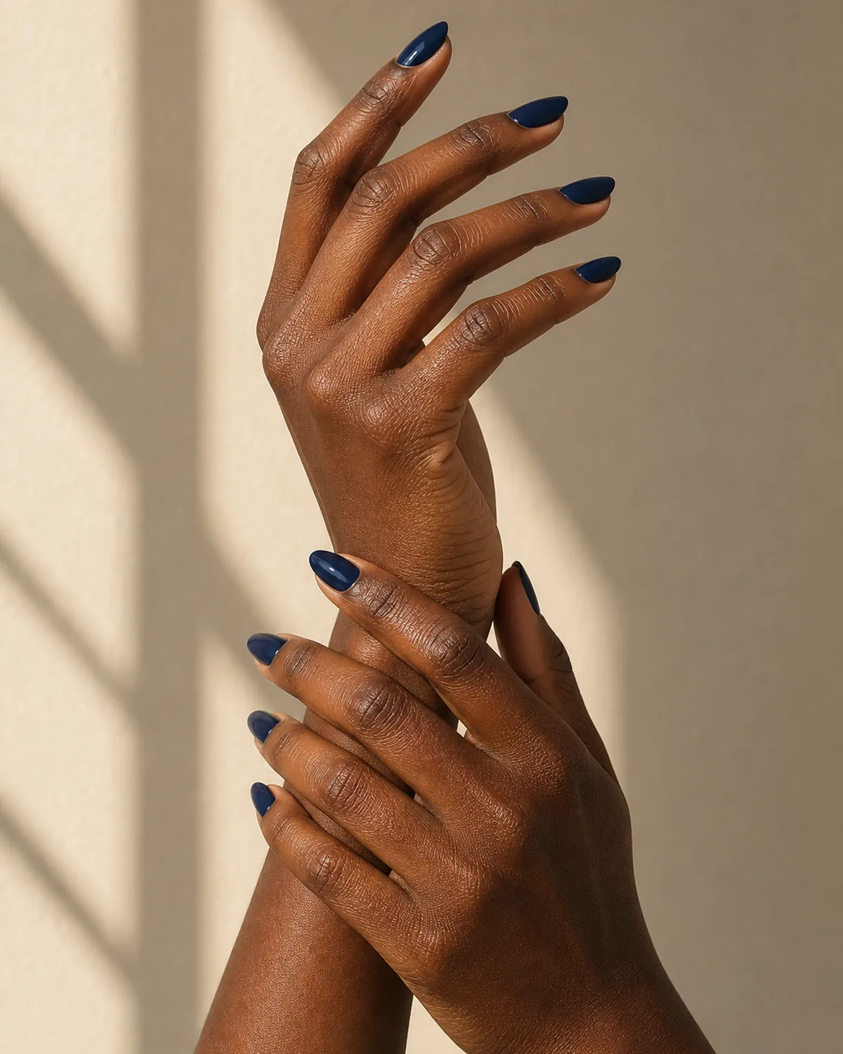
- Deep glossy navy blue: the polish equivalent of a tailored blazer.
- Almond shape draws the eye to color depth, not shape drama.
- Absorbs light rather than reflecting it — sculpts the nail visually.
- Reads as an heirloom choice, not a trend-driven one.
- Best paired with gold jewelry and nothing competing.
9. A Quiet Shimmer That Only Shows Up When She Moves Her Hands
A nude-pink base embedded with micro-shimmer particles so fine they are invisible in still photographs. The effect reveals itself in motion — a flash of silver-gold across the nail surface when her hand turns a page or lifts a glass. Shimmer, not glitter. The distinction matters.
The nude-pink base is doing double duty: it matches the skin tone closely enough to disappear, which means the shimmer has no visible base to sit on. The particles appear to float directly on the surface of the finger. In still light, these nails look like a clean nude manicure. In motion, they catch a single flash and release it. That restraint is what separates shimmer from sparkle.
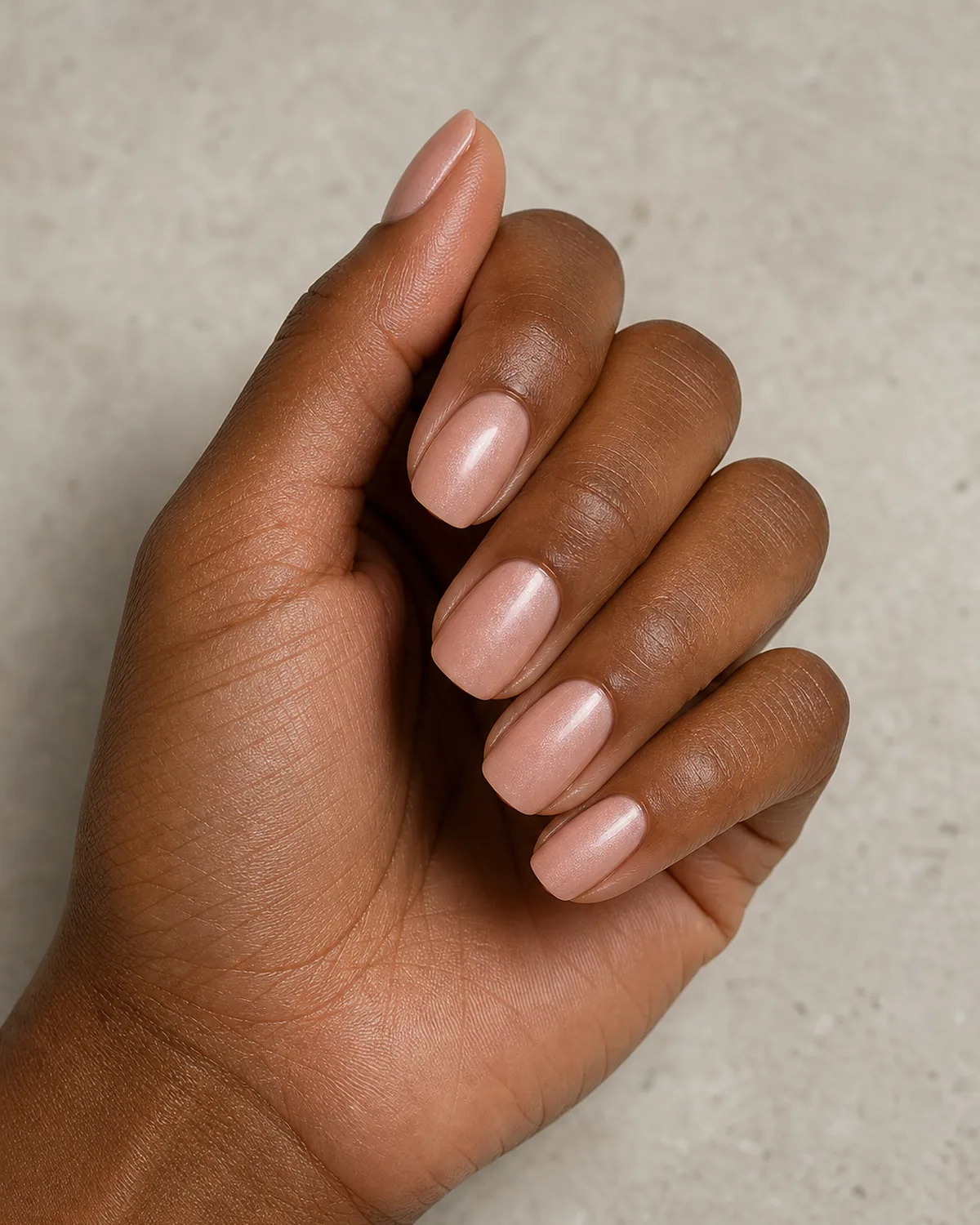
- Nude-pink base with micro-shimmer particles embedded within.
- Invisible in still photographs, visible only in motion.
- Shimmer, not glitter — fine particles, not chunky flakes.
- The nude base disappears, making the shimmer float on skin.
- Restraint that separates quiet luxury from decoration.
10. Espresso Glaze on a Stiletto — Rich Without Being Loud
A deep espresso brown with a glazed, almost wet-look finish on a medium stiletto. The glaze adds depth without glitter or dimension, making the surface look like polished mahogany. Dark polish on a pointed shape often reads edgy; the warm brown softens the silhouette into something elegant.
The warm undertone is doing the work of domestication. Espresso brown carries the same depth as black but without the subcultural connotations. The stiletto shape provides the structure; the brown provides the warmth; the glazed finish provides the surface interest. Together, they create a nail that looks expensive and intentional without belonging to any single aesthetic tribe.
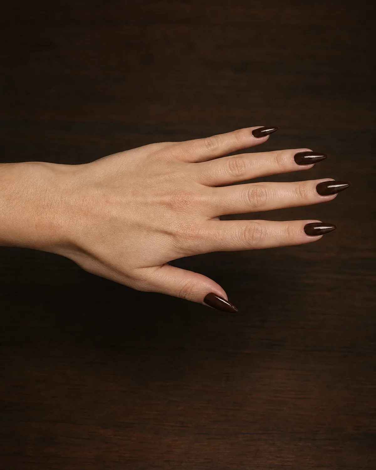
- Deep espresso brown with a glazed wet-look surface.
- Medium stiletto shape is structured without being aggressive.
- Warm brown softens the pointed shape into elegance.
- Surface looks like polished mahogany — depth without sparkle.
- The dark nail that reads rich rather than rebellious.
15 Classy Nail Ideas to Try
- 1Chocolate French tipThe white tip rewritten in warm espresso on almond, polished without being predictable.
- 2Boardroom burgundyA single deep burgundy coat on short square with no tricks, the color doing all the heavy lifting.
- 3Tonal mauveA dusty mauve between nude and plum, sitting exactly where expensive-looking polish lives.
- 4Sheer wine veilOne coat of sheer wine jelly with the nail bed glowing through, a velvet depth opaque polish cannot match.
- 5Gold-foil half-moonA matte nude base with a thin crescent of gold foil at the half-moon, the quietest accent possible.
- 6Desk-to-dinner mushroomA warm mushroom greige on coffin under one high-gloss coat, corporate by day and candlelit by night.
- 7Thin burgundy tipsPaper-thin burgundy lines over sheer petal pink on oval, a French manicure that whispers.
- 8Tailored navyOne glossy coat of dark navy on almond, reading heirloom rather than trend.
- 9Motion shimmerA nude-pink base with micro-shimmer invisible in photos, flashing only when the hands move.
- 10Espresso glazeA wet-look espresso glaze on medium stiletto, deep as polished mahogany without a single spangle.
- 11Expensive blackGlossy black on short oval under a mirror topcoat, shifted from gothic to expensive.
- 12Taupe gradientA cuticle-to-tip fade from warm taupe to pale cream on squoval, subtle as natural variation.
- 13Old-money pinkClassic pale pink on squoval under two glass-like topcoats, the request that never goes wrong.
- 14Single pearl accentA warm blush set with one flat pearl on the ring finger, just enough and never too much.
- 15Ring-first nudeA satin warm nude on almond designed to sit beneath the jewelry, never compete with it.
styvea.com
11. The Black Nail That Does Not Look Gothic, Just Expensive
One coat of glossy black on short oval nails. No matte finish, no nail art, no accent nail. When black is applied on a shorter, rounder shape with a mirror-like topcoat, it shifts from alternative to editorial. The shape domesticates the color the way a cashmere crewneck domesticates combat boots.
The short length removes the edge. Black on a long stiletto signals a subculture. Black on a short oval signals an editorial sensibility — someone who knows the color well enough to use it as a neutral rather than a statement. The glossy finish adds a reflective surface that catches light and prevents the nail from reading as flat or heavy.
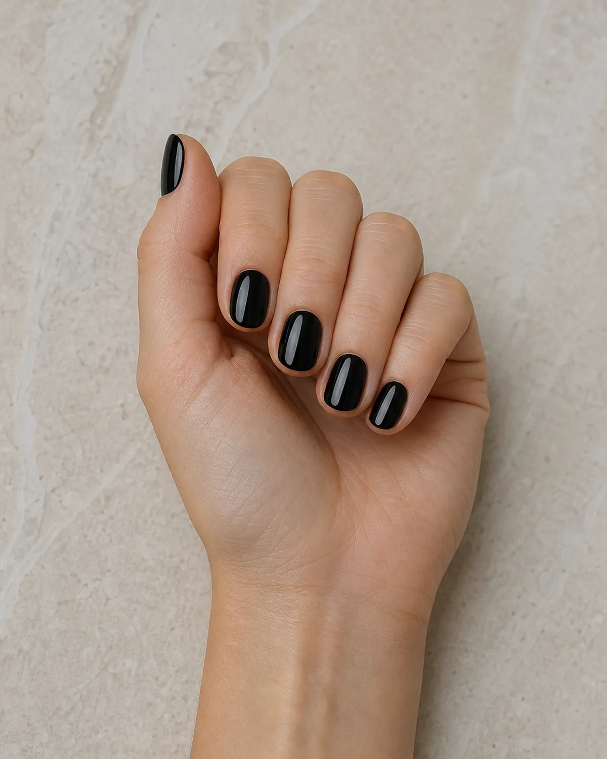
- Glossy black on short oval: editorial, not alternative.
- Short length removes the subcultural edge of dark polish.
- Mirror-like topcoat adds reflective dimension to prevent flatness.
- No accent nails, no texture — the color is the statement.
- The cashmere crewneck principle applied to nail polish.
12. Taupe Gradient Fading from Cuticle to Tip
A refined ombre that moves from a warm taupe at the cuticle line to a pale cream at the free edge. The transition is so gradual it looks more like natural variation than nail art. On a medium squoval, this gradient replaces a solid neutral with something that holds the eye longer without trying.
The gradient works because both ends of the spectrum are neutral. There is no color clash, no contrast shock — just a smooth shift from warm to cool within the same muted family. The effect is visible at arm's length but subtle enough that it reads as a beautifully maintained natural nail rather than a designed effect.
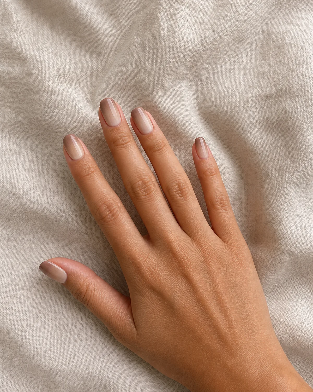
- Warm taupe to pale cream gradient: ombre within the same neutral family.
- Medium squoval provides a clean canvas for the gradual shift.
- Transition so smooth it reads as natural variation, not nail art.
- Visible at arm's length, subtle enough to pass as nature at distance.
- Replaces a flat neutral with something that rewards closer attention.
13. She Asked for "Old Money Nails" and Left with This
Classic pale pink on a squoval shape, finished with two coats of high-shine topcoat until the surface looks dipped in glass. This is the manicure that salon technicians describe as old money — the request they hear most from people who want to look polished without looking decorated. No accent nails. No texture play. Just the pink, the shape, and the shine.
The squoval shape is the silent partner here. Round enough to look natural, straight enough to look manicured, it occupies the geometric middle ground that says maintained without saying designed. The pale pink is chosen to sit one shade warmer than the natural nail bed, creating the impression of healthy, even color rather than applied polish.
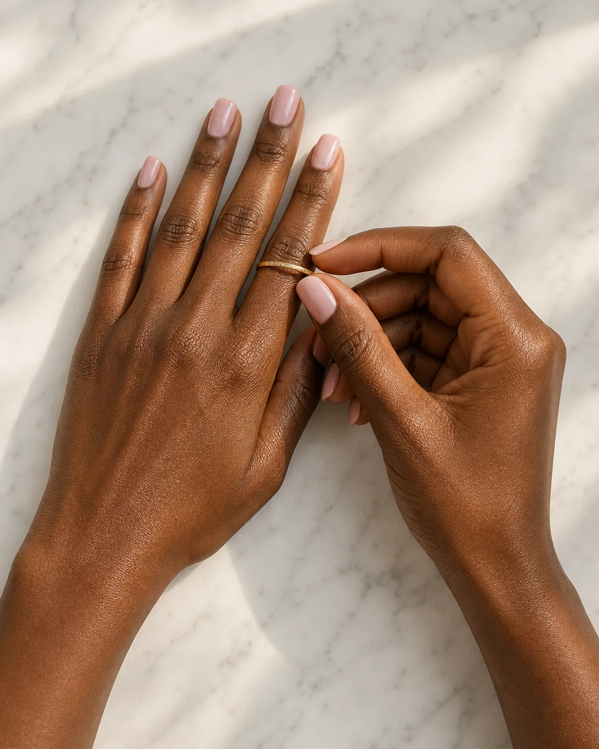
- Classic pale pink with two coats of ultra-high-shine topcoat.
- Squoval shape: the geometric middle ground between round and square.
- Sits one shade warmer than the natural nail bed for a healthy glow.
- The salon request that comes in as "old money nails."
- No accent nails, no texture, no embellishment — irreducible polish.

Sloane Avery edits Styvea, where she shares nail design ideas, shapes, colors, and at-home manicure how-tos for anyone who loves a good manicure. Every guide is reviewed for clarity, usefulness, image accuracy, and Pinterest-to-page alignment before publication. Visit the About page.
14. Pearl Accent on One Nail — Just Enough, Never Too Much
Fourteen nails in a warm blush tone, one ring-finger nail carrying a single flat pearl pressed into the center near the cuticle. A tiny accent that elevates the entire set without entering bridal territory. The restraint is the point — one embellishment, one nail, one pearl.
The flat pearl sits flush with the nail surface rather than rising above it, which prevents it from catching on fabrics or looking three-dimensional from a distance. It reads as a subtle imperfection — a detail that someone placed deliberately and then moved on from. The warm blush base is chosen specifically to complement the pearl's iridescence without competing with it.
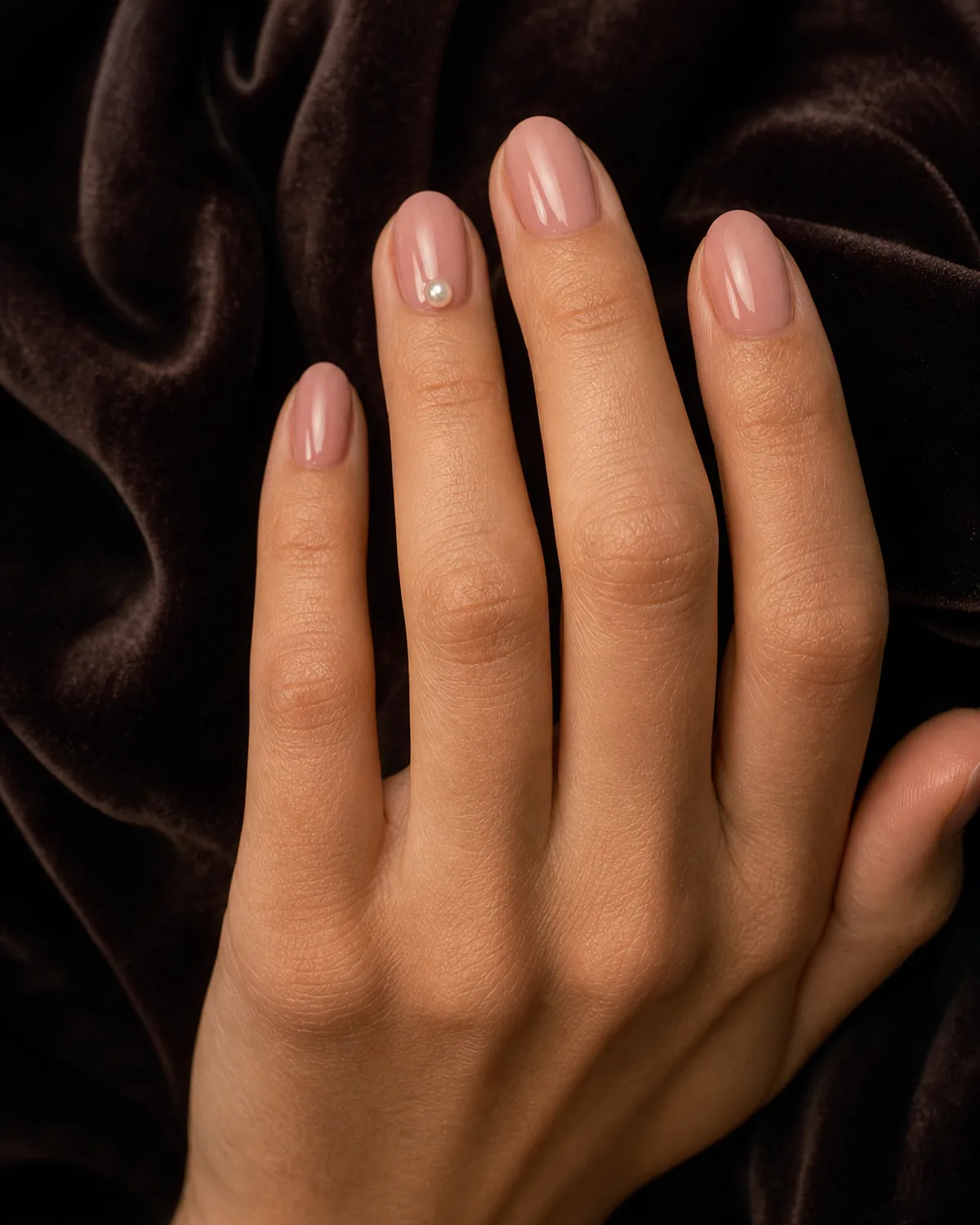
- Single flat pearl pressed near the cuticle of the ring finger.
- Warm blush base across fourteen nails, one accent nail.
- Pearl sits flush — no snag risk, no dimensional protrusion.
- The embellishment elevates without entering bridal territory.
- One pearl, one nail, one decision — then stop.
15. Sloane's Rule: If the Nail Competes with the Ring, Start Over
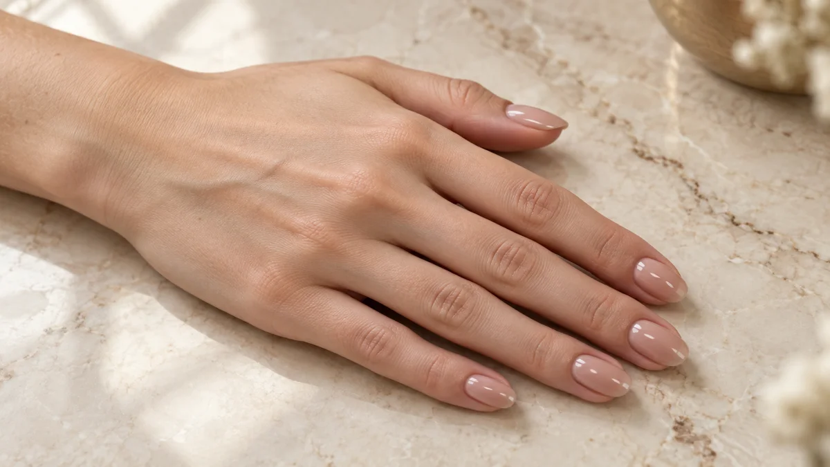
A warm nude almond set designed to sit beneath, not beside, the jewelry it accompanies. The finish is satin — not matte enough to look dry, not glossy enough to compete with metal. This is the set Sloane reaches for when the hands will be photographed, held, or noticed — because the best classy nails are the ones that let everything else on the hand do the talking.
The satin finish is the distinction. A matte nude can look chalky in photographs. A glossy nude catches the same light as a ring and competes for attention. Satin absorbs most of the light and returns a diffused glow — present enough to look intentional, quiet enough to defer. That is the philosophy of classy nails in a single finish choice: be there, be right, and then get out of the way.
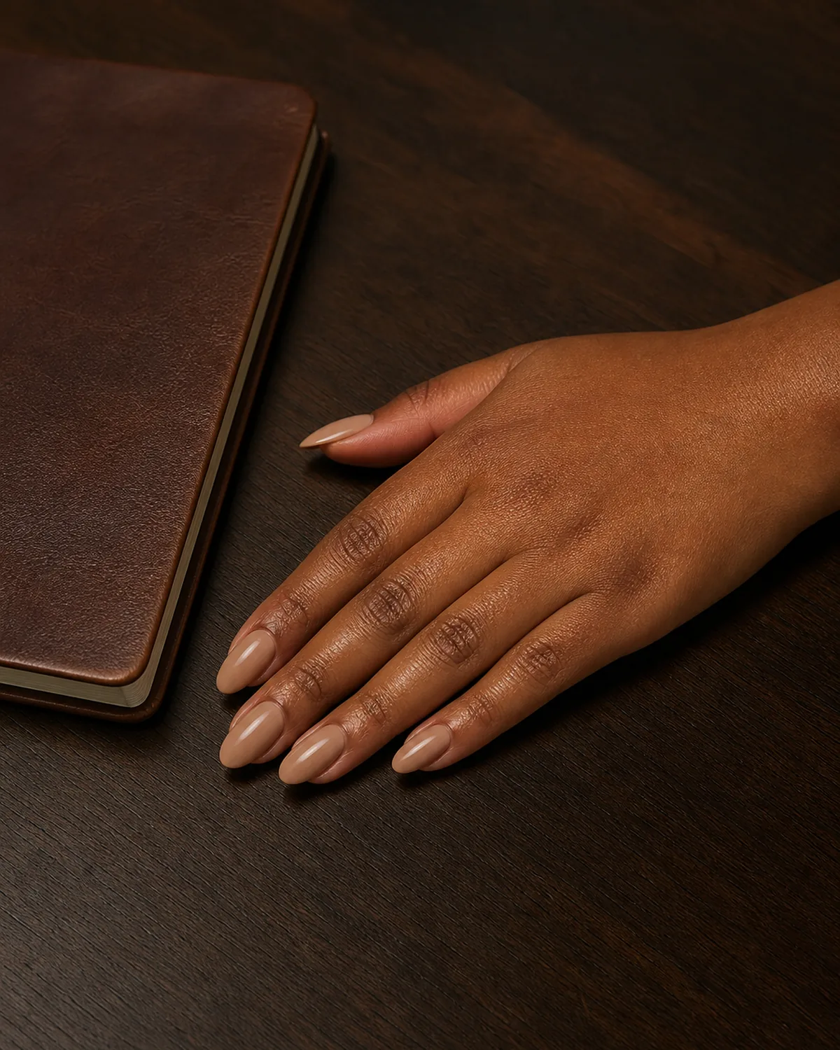
- Warm nude on almond: designed to support jewelry, not compete.
- Satin finish: diffused glow without the glare of high-gloss.
- The set for photographed, held, and noticed hands.
- Not matte enough to look dry, not glossy enough to fight metal.
- Classy nails in one sentence: be there, be right, and defer.
Quick answers for the most common questions about classy, polished nail designs.